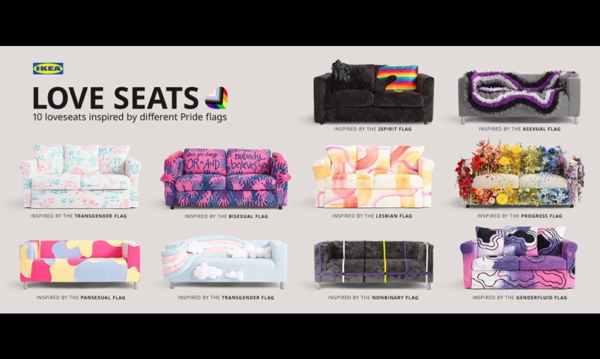
comScore

design

  1. Tech

    A Brief History of Tumblr Layout Changes and Why I’ve Hated All of Them

    Tumblr and I have been through a lot together. I first got mine about four years ago, back when Tumblarity was still a thing and people actually respected David Karp as a person, and I’ve hated it and loved it in equal amounts ever since. At this point I’ve started to experience something not unlike highway amnesia when it comes to the now ubiquitous blogging platform — I’ll open Google Chrome while trying to show my roommate a Youtube video on, you know, Youtube, and all of a sudden I’ll find myself three pages deep into my dashboard with no idea what just happened. But the more time I spend on the website, the more I tell myself that I really need to give it up and find some new social media hangout, because the sheer amount of changes they’ve made to the site and the way that they’ve handled every single one send me into a mini rage spiral every time I think about them. I can feel my teeth grinding right now, guys.

    Read on...
  2. Uncategorized

    Apple Paid a Cool $21 Million to License the Clock Design They Stole

    As some might recall, part of Apple's move to iOS 6 included a new clock design. Unfortunately for them, this clock design was suspiciously similar to the one used by Swiss national rail company SBB. They knew it, and SBB knew it. Everyone that even so much as glanced at the two designs knew it. So, like usual, Apple settled with SBB for an undisclosed sum in order to license the design. How much is a clock design worth? Well, when you're licensing it after the fact, it looks like a clock design is worth around $21 million.

    Read on...
  3. Uncategorized

    Apple Signs Licensing Agreement With Swiss Rail Company, Proves It’s Better to Beg Forgiveness

    As we've previously reported, Apple's iOS 6 update included a new clock design that was suspiciously similar to the one used by the Swiss national rail company SBB. So similar, in fact, that SBB was pretty upset that Apple went ahead and used it without contacting them. Proving that it actually is better to beg forgiveness than ask permission, SBB and Apple have now signed a licensing agreement for an undisclosed amount. Lovely.

    Read on...
  4. Uncategorized

    New Font For Smartphones, Browsers May Offer Help for Dyslexics

    A new font -- now available for free use on smartphones and in web browsers -- may make it easier for people who suffer from dyslexia to communicate digitally. Some recent studies have shown that bottom-heavy fonts -- those in which the letters appear a little thinker at the bottom than they do at the top -- can provide relief for some dyslexic patients by making them less likely to invert letters and words while reading. OpenDyslexic is available on Android phones for download, as well as through the iOS app openWeb, which converts websites in Safari into the easier to read OpenDyslexic.

    Read on...
  5. Uncategorized

    Swiss Rail Company Accuses Apple of Clock Copying, Couldn’t Make This Stuff Up

    The world of copyright and licensing is one full of convoluted oddities. Apple's no stranger to this habitat, as they've happily shown in the past, but it's unusual for the company to actually be on the defensive. They're almost always the aggressor in such cases, but their recent clock app design upgrade in iOS 6 may have landed them in the hot seat with Switzerland's national rail company.

    Read on...
  6. Uncategorized

    Convertible Privacy Booth Chair is Exceptionally Unsubtle

    Combining all the privacy of a voting booth with the class and utility of a truck cap, this hooded chair is designed to give you some alone time. Complete with a detachable shroud, the chair goes from being a drab little seat to a coffin-like enclosure within seconds. Why? Who knows.

    Read on...
  7. Uncategorized

    Here’s More or Less Every Apple Product in Just Over 30 Seconds [Video]

    Apple has been around since the very dawn of the Silicon Valley, and has always been a forerunner in unique design. With such a pedigree, wouldn't it be nice to view the company's entire design history in one quick, 39 second rundown? Well, thanks to Rob Beschizza, now you can. Though the images fly by at breakneck speed, I didn't notice any major oversights. For the truly brave, you can see all of the computers made by NeXt, Steve Jobs' other computer company, after the break.

    Read on...
  8. Uncategorized

    The U.S. Highway System, as a Subway Map

    As any student of bus or subway maps can tell you, the two-dimensional representation of a transit system is usually far from accurate. Bus routes and tunnels are made with geographical and geological issues in mind and would just be confusing if laid bare. With that in mind, designer Cameron Booth took a similarly minimalist approach to mapping the U.S. highway system. Styled after subway maps, the result is an eye-opening look at the country, and how people get around it. See more images, and a subway-style map of the entire US, after the break.

    Read on...
  9. Uncategorized

    One Small Apartment Plus One Huge, Transforming Cabinet Somehow Makes Four Rooms

    When school teacher Eric Schneider bought his Manhattan apartment in 2005, had achieved what, for most, is an unachievable dream. However, the realities of life in the big city can be daunting: His apartment was a mere 450 square-feet, and consisted of a single room with an attached kitchen. That's when architects Michael Chen and Kari Anderson at Normal Projects designed an amazing transforming cabinet that turned his studio into four room home. Read on after the break, and see how this tiny apartment unfolds into an amazing living space.

    Read on...
  10. Uncategorized

    This Raincoat Has an Integrated Umbrella Because Why Not

    I'm all for the integration of devices -- put a camera or an iPod in my phone and I'll probably use it. But some things are best left separate, as demonstrated by the so-called Umbrella Raincoat concept from Athanasia Leivaditou. This waterproof garment features a ribbed, flip-down hood that provides maximum rain protection to your face while leaving your hands free. It also looks like someone parked a baby's perambulator on your head. Unfortunately, the design lacks the major advantage of an umbrella in that this hood only keeps your head dry. So while the Umbrella Raincoat (Umbrelcoat? Bumbercoat?) will guard your face, whatever you've got in your hands will be soaked. Also, it can be worn as either a floor-length trench coat or a jump suit through the miracle of zippers. Because why not.

    Read on...
  11. Uncategorized

    Brain Light: Insert Obligatory “Bright Idea” Joke Here

    This ingenious design from Belarus-based Maria and Igor Solovyov takes the twisting form of high-efficiency compact fluorescent bulbs and forms it into a facsimile of the human brain. A clever, though as-yet unpurchasable, design, the brain light shows that a little artistry can take everyday objects and move them into the realm of the fantastical. Also, it would make for great, cartoony sight-gags around the home. (Solovyov Design via If It's Hip It's Here)

    Read on...
  12. Uncategorized

    Everything You Always Wanted to Know About Nazi Insignia But Were Too Afraid to Ask

    If you've ever wondered what a member of the SS wore to the gym, or which sailor suit was appropriate for a Nazi rally than look no further than ORGANIZATIONSBUCH DER N.S.D.A.P., which is a long name for what is essentially the design manual of the Nazi party. This exceptionally rare book contains, in the bookseller's words:
    There are over 70 full-page, full-color plates (on heavy paper) that depict virtually every conceivable Nazi flag, uniform and insignia from the Führer Standard and Blood Order to the SS Honor Ring, and from the Hitler Youth leader's dagger and sailor suits to Reichsarbeitsdienst Gorgets. There is a picture of a Nazi nurse in uniform, an Honor Pistol (a Walther PPK) and its holster, musicians uniforms, etc. There are patterns for official Nazi Party office signs, special armbands for the Reichsparteitag (Reichs Party Day), the Honor Badges of various Gaue and early Reichs Party Days. It has been said that Germans in general have a tendency to “over-explain the obvious” and this book leaves no Nazi Party organization question unanswered. It perfectly fulfilled its sole purpose.
    Of course it's incredibly creepy. Even creepier is the forward by Adolf Hitler and an entire chapter (with illustrations!) on the dangers of race mixing. This may be at it's core a design manual, but make no mistake: it contains just as much of the disgusting worldview as Mein Kampf. This book, and the annual updates, contained the entire National Socialist Party -- it's bureaucracy and its iconography -- in a nutshell. After the surrender of Germany, Allied Forces destroyed the book in droves, perhaps as much out of spite as anything else. Or maybe they didn't want the imagery of the Nazis being used by other groups in a bid for power and legitimacy. This book is now, ironically enough, a collector's item, but also a window into a twisted worldview. (USM books via J-Walk Blog, image via Design Observer)

    Read on...
  13. Uncategorized

    “We Are Not Time Travelers”: Modern Technology Circa 1977

    Earlier this week, San Francisco-based designer Alex Varanese released a series of hypothetical posters titled "ALT/1977: WE ARE NOT TIME TRAVELERS" visualizing an MP3 player, a laptop, a cell phone, and a handheld video game system, as if they were created in the 1970s. The seventies: Star Wars, The Godfather, and the first supercomputer? I'd travel there (then?) in a heartbeat. More images after the jump.

    Read on...
  14. Space

    The NASA Logo, Redesigned

    When Viewpoint magazine asked design firm BaseNow "If you could redesign any brand, which would it be?" they arrived at an answer quickly and unanimously: NASA.

    Base's view is that NASA's traditional "meatball" logo isn't bad, exactly, it's just that "what looks futuristic today looks passe tomorrow. And of course tomorrow comes faster today than it did yesterday." We can see their point, after all, who knows today that the red chevron in the logo represents the shape of planned hypersonic airplane wings in 1959? But we're still not sure if we like their replacement.

    Read on...
  15. Uncategorized

    Coming Soon: Dribbble, a Twitter for Developers

    It seems someone has taken the Twitter mold and made something useful with it (or, at least, more useful). A new site called Dribbble is soon to open up to the public and allow developers to showcase the projects they're working on.

    From website's official blog:

    "Dribbble is show and tell for designers, developers and other creatives. Members share sneak peeks of their work as “shots” — small screenshots of the designs and applications they are working on. It’s also a place to talk design, give and receive feedback and iterate toward better work."

    Read on...