Read Article XKCD Creator Randall Munroe Making Content For High School Textbooks Category: Science Science XKCD Creator Randall Munroe Making Content For High School Textbooks
Read Article Behold! The 2014 Hugo Award Nominees! Category: Movies Movies Behold! The 2014 Hugo Award Nominees! Becky Chambers Becky Chambers Apr 20, 2014
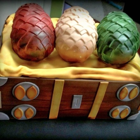
Read Article Things We Saw Today: A Dragon Egg Cake Fit For A Khaleesi Category: Big on the Internet Big on the Internet Things We Saw Today: A Dragon Egg Cake Fit For A Khaleesi Becky Chambers Becky Chambers Mar 30, 2014
Read Article XKCD’s Randall Munroe Finally Getting a Book Deal for “What If?” Category: Science Science XKCD’s Randall Munroe Finally Getting a Book Deal for “What If?” Victoria McNally Victoria McNally Mar 12, 2014
Read Article Best-Dad-Ever Made His Baby Daughter an Adorable LED Halloween Costume [Video] Category: Big on the Internet Big on the Internet Best-Dad-Ever Made His Baby Daughter an Adorable LED Halloween Costume [Video] Dan Van Winkle Dan Van Winkle Oct 23, 2013
Read Article XKCD Creator Randall Munroe Making Content For High School Textbooks Category: Science Science XKCD Creator Randall Munroe Making Content For High School Textbooks Charline Jao Charline Jao Mar 23, 2016
Read Article Behold! The 2014 Hugo Award Nominees! Category: Movies Movies Behold! The 2014 Hugo Award Nominees! Becky Chambers Becky Chambers Apr 20, 2014
Read Article Things We Saw Today: A Dragon Egg Cake Fit For A Khaleesi Category: Big on the Internet Big on the Internet Things We Saw Today: A Dragon Egg Cake Fit For A Khaleesi Becky Chambers Becky Chambers Mar 30, 2014
Read Article XKCD’s Randall Munroe Finally Getting a Book Deal for “What If?” Category: Science Science XKCD’s Randall Munroe Finally Getting a Book Deal for “What If?” Victoria McNally Victoria McNally Mar 12, 2014
Read Article Best-Dad-Ever Made His Baby Daughter an Adorable LED Halloween Costume [Video] Category: Big on the Internet Big on the Internet Best-Dad-Ever Made His Baby Daughter an Adorable LED Halloween Costume [Video] Dan Van Winkle Dan Van Winkle Oct 23, 2013
Read Article 40 Webcomics You Need to Read Category: Uncategorized Uncategorized 40 Webcomics You Need to Read Rebecca Pahle Rebecca Pahle Aug 14, 2013
Read Article Randall Munroe Finally Finishes His 3,099 Panel xkcd Magnum Opus “Time” Category: Movies & TV Movies & TV Randall Munroe Finally Finishes His 3,099 Panel xkcd Magnum Opus “Time” Glen Tickle Glen Tickle Jul 29, 2013
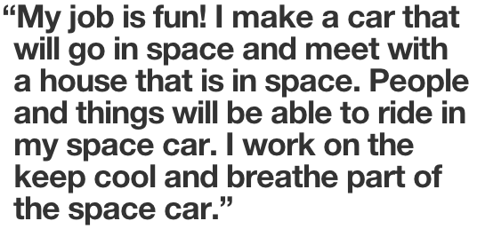
Read Article Female Scientists Describe Their Jobs Using Only the 10,000 Most Common English Words Category: Uncategorized Uncategorized Female Scientists Describe Their Jobs Using Only the 10,000 Most Common English Words Susana Polo Susana Polo Jan 23, 2013
Read Article xkcd Comic “Click and Drag” Turned Into an MMO Category: Gaming Gaming xkcd Comic “Click and Drag” Turned Into an MMO James Plafke James Plafke Sep 27, 2012
Read Article Everything You Need to Know About Today’s xkcd Comic, “Click and Drag” Category: Big on the Internet Big on the Internet Everything You Need to Know About Today’s xkcd Comic, “Click and Drag” James Plafke James Plafke Sep 19, 2012
Read Article So What <em>Would</em> Happen If Everyone on Earth Jumped At the Same Time? Category: Uncategorized Uncategorized So What Would Happen If Everyone on Earth Jumped At the Same Time? Alanna Bennett Alanna Bennett Aug 22, 2012
Read Article All of the Exoplanets, to Scale, Courtesy of xkcd [INFOGRAPHIC] Category: Space Space All of the Exoplanets, to Scale, Courtesy of xkcd [INFOGRAPHIC] Max Eddy Max Eddy Jun 21, 2012
Read Article Which Sites Are Going Black to Protest SOPA/PIPA? Category: Uncategorized Uncategorized Which Sites Are Going Black to Protest SOPA/PIPA? Jamie Frevele Jamie Frevele Jan 18, 2012
Read Article Happy Ada Lovelace Day! Category: Uncategorized Uncategorized Happy Ada Lovelace Day! Susana Polo Susana Polo Oct 7, 2011
Read Article 40 Webcomics You Need to Read 40 Webcomics You Need to Read Rebecca Pahle Rebecca Pahle Aug 14, 2013
Read Article Everything You Need to Know About Today’s xkcd Comic, “Click and Drag” Everything You Need to Know About Today’s xkcd Comic, “Click and Drag” James Plafke James Plafke Sep 19, 2012
Read Article xkcd’s Tetris Hell Now a Playable Game: Play it Here! xkcd’s Tetris Hell Now a Playable Game: Play it Here! Robert Quigley Robert Quigley Apr 9, 2010
Read Article xkcd Makes 4D Miegakure the Most-Sought Indie Game: What You Need to Know xkcd Makes 4D Miegakure the Most-Sought Indie Game: What You Need to Know Robert Quigley Robert Quigley Mar 31, 2010
Read Article Valentine’s Day Cards, xkcd Style Valentine’s Day Cards, xkcd Style Robert Quigley Robert Quigley Feb 11, 2010